What’s in my bag…

image11

I like to read blogs and watch videos about what art supplies that artists like to take with them on the go.  So, I thought I would throw in my two cents and show you what I bring with me on road trips.  Even if I am driving, I still like to bring these items with me because you will never know when the mood will strike to create something.   I will admit that this isn’t too exciting, but for now it is everything that I need or want to bring…minus the snacks of course 🙂

I still have a love/hate relationship with watercolor at the moment but I am hardheaded so of course I have a few supplies to curse at while I’m on a trip.

Strathmore Watercolor Pad

Water Brush

Winsor & Newton-12 half pan travel set

My first love….Drawing….can’t forget that!

Casemate Sketch Diary-

General’s Kneaded Eraser

Black Pearl Eraser

Faber Castell Pencils – HB, 2H, B, 2B, 4B

Faber Castell Typewriter Eraser

Blending Stumps

Click Eraser

Pen Mate Duo Expert Lead Pencil

Kol-I-Noor – 24 Color Woodless Pencils – (Artist quality pencils are too fragile for me to bring along. They would probably be okay but I don’t want to risk it.)

 Years ago I use to be into calligraphy.  Modern and Brush Calligraphy has really caught my eye….So, have been playing around with that as well.  I may want to Zentangle too.

U:create Smooth Paper

Speedball Calligraphy Set

Tom Bow Brush Pen – hard

Tom Bow Duo Brush Pen

Sukura Brush Pen

Faber Castell Pitt Artist Pen

Pencil Case- Made for me by SIL Vicki Welsh (isn’t it pretty)

Not pictured that I will usually bring is:

*travel pencil sharpener

*a couple of paper towels

And I can’t forget my kindle and a bit of knitting.

It seems like a lot of projects to bring a long and I may not touch a bit of it but it is there if the inclination hits me.  Its better to have it and not want it than to want it and not have it, lol

So what do you bring along with you on trips?  What are your must haves?

Be Well and Happy!

scan0001

My Sketching Essentials…

There are so many supplies available for the artist to work (or play) on the go.  The equipment can get really elaborate as well as expensive.  So, I have put together a few things I have carried with me from time to time with no problems.  By problems I mean,  I have never sat down to sketch and said, “Man! I wish I would have brought_____!”

Sketching

DSC_0012

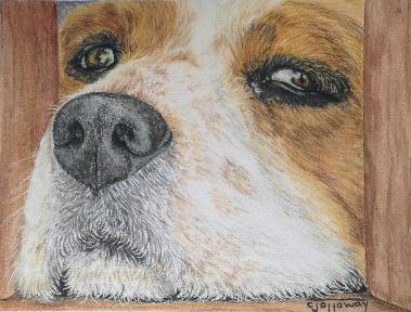
I am first and foremost a graphite girl! I like to draw on a smooth papers. And the above are  my papers of choice.

400 Series Strathmore Drawing Pad – 8 x 10, 80 lb., pad is coiled so it folds flat (which is awesome).  Paper has a slight tooth, but I still consider this a smooth(ish) paper.

400 Series Strathmore Sketch Pad – 5.5 x 8.5, 60 lb., pad is also coiled, slight tooth and not as thick as the 80 lb.

-Canson Drawing – 5.5 x 8.5, 70 lb., pad is coiled and has very little tooth.  It is the mid range weight between the two pads above.

-Canson Drawing – 5.5 x 8.5,  65 lb., pad is coiled, slight tooth and also a good mid range weight

The two Canson pads are not available, but here is a link to see the Canson line.

Moleskine Journal – unlined, stapled and smooth tooth, compact and very versatile.

Tools

pencil

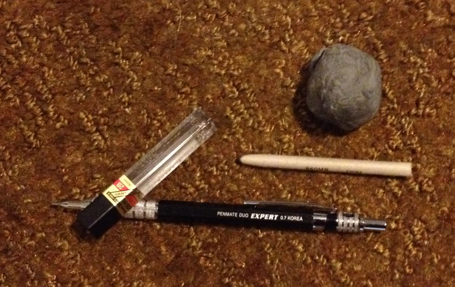
These are all the tools I need to keep me happy!

A stump – for blending

A kneaded eraser – erasing mistake of course 😉

2B lead – a very versatile degree of graphite. Depending on the amount of pressure and using a stump, this one soft graphite can give you anywhere from a 4H, 3H, 2H, H, HB,  as well as 2B!

Lead Pencil – Trimming your pencil may not be an option, so for me a lead pencil is a definite must.

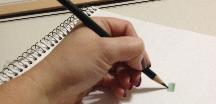
When I want to sketch on the go and I don’t want to or can’t take a bigger pad.  I throw a Moleskine, stump, kneaded eraser, lead and a lead pencil in a Ziploc baggie and off I go!

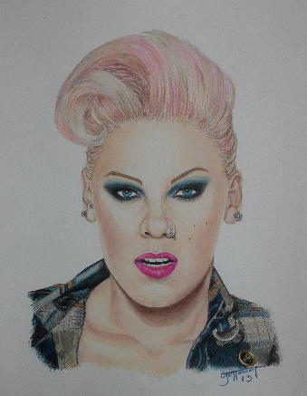
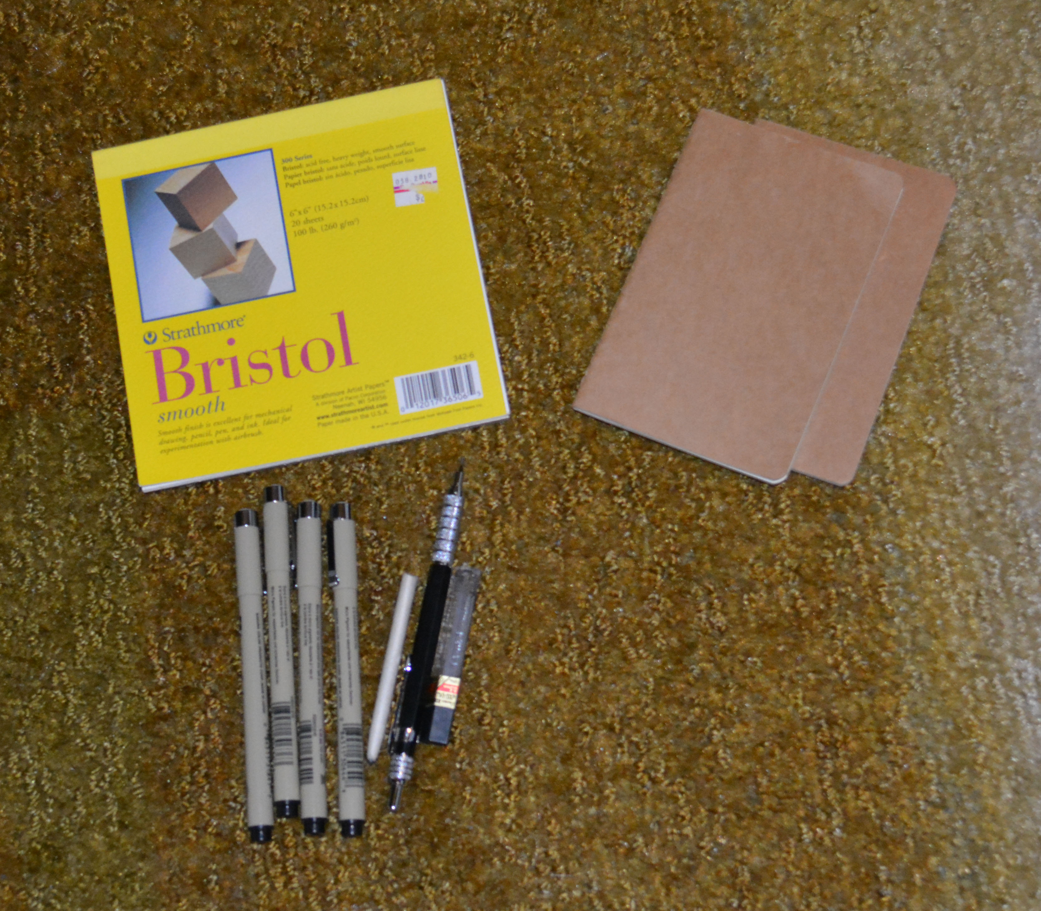
Colored Pencil…Would be essentials

DSC_0014

I rarely take colored pencil on the go.  I may if we are traveling by car, but not usually as a rule.  If I decided to and I had no plan in mind, this is what I would probably take with me. I bought this portfolio from Dick Blick many years ago, and I love it.  The portfolio holds a pad of paper, 12 Prismacolor Pencils, and a sharpener.

The additional pad:

300 Series Strathmore Bristol Smooth – 6 x 6, 100 lb. paper, heavyweight paper that will hold many layers of pencil.

Tools

-Colored Pencil Portfolio – I bought this on clearance for a whopping $20.00…ikr, yay me!  Sadly, I don’t think this is available anymore.

A 12 color pack of colored pencils

A kneaded eraser

-Sharpener

Lead Pencilnot shown.

typing eraser – great hard eraser

Prismacolor blender pencil

-A Baggie – for pencil shavings

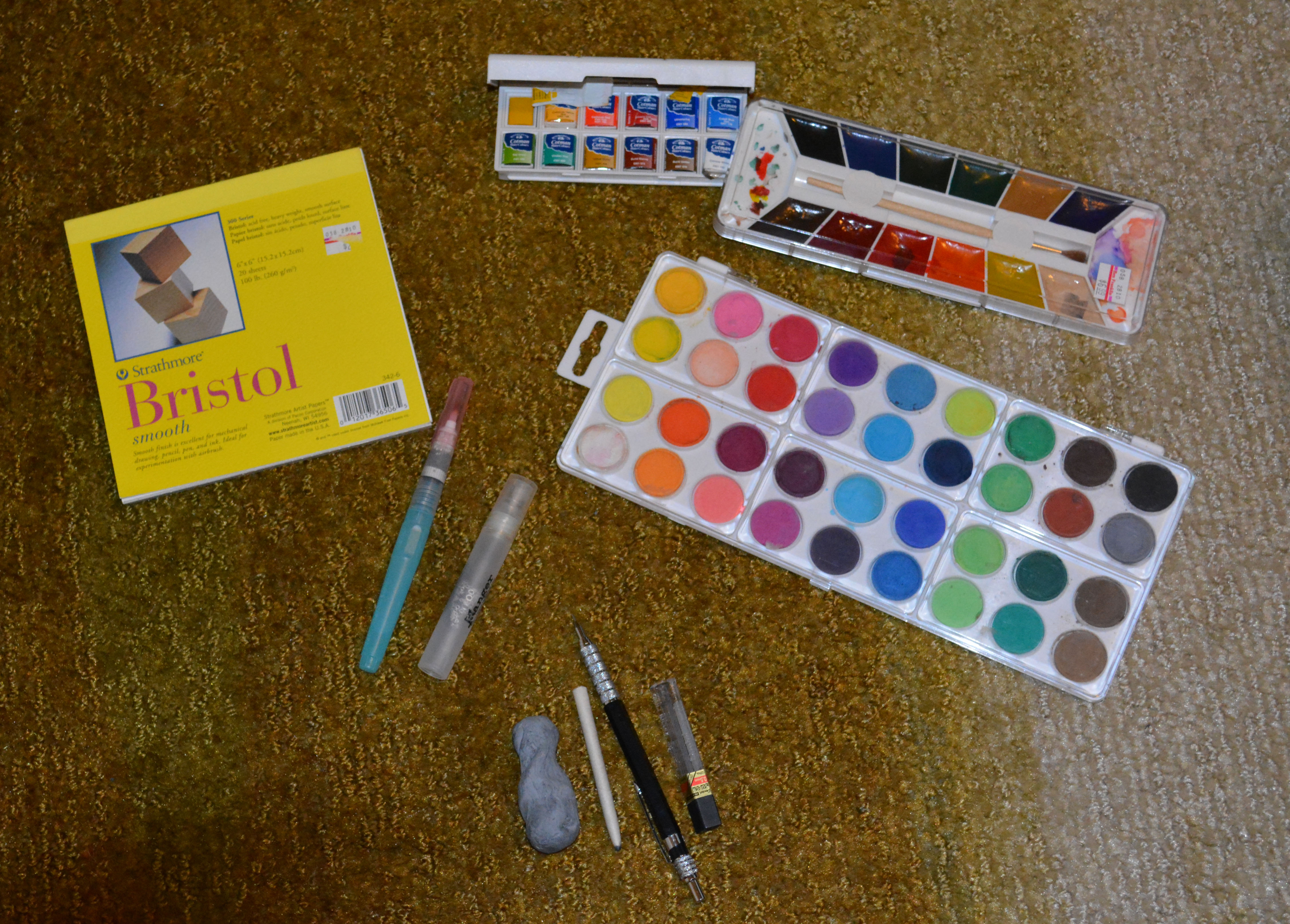
Watercolor….Would be essentials

DSC_0018

I haven’t had the pleasure of working in watercolor (yet).  But I do have a few things that I would choose as my essentials if I were to paint on go.

Paper

300 Series Strathmore Bristol Smooth – 6 x 6, 100 lb. paper, heavyweight paper that will hold many layers of pencil.

Other watercolor pads

Tools

Loew-Cornell dry watercolor pan

-12 color pan no longer available
Winsor & Newton – 12 color travel set – linked to a similar set

or Watercolor Pencils not pictured

Travel water brush

-A Mister

-a folded paper towel not pictured

A stump

A kneaded eraser

2B lead

Lead Pencil

Ink

DSC_0020

Sometimes, I want to  Zentangle  and this is perfect to throw in my purse!

Paper

300 Series Strathmore Bristol Smooth – 6 x 6, 100 lb. paper, heavyweight paper

Moleskine Journal – unlined, staples and smooth., compact and very versatile.

Tools

Micron Pens

2B lead

Lead Pencil

A stump

A kneaded eraser

I think oil and acrylic would fall under the en plein air category.  And since we all can’t know everything I have no idea what a charcoal or pastel artist would carry.  But I would definitely be interested in finding out.

Nothing is set in stone and you should carry what makes you feel comfortable. For me these things mentioned is what makes me comfortable to sketch in the past and what I shall continue to have with me in future.

What are your go to sketching essentials?

Be Well and Happy!

Tricks and Troubleshooting…

  1. Rubber shelf liners are perfect to lay under your work area.  The rubber like quality will keep your pencils from rolling in the floor and breaking.
  2. When your lead is broken in the shaft.  you can wrap the pencil in a paper towel and microwave for a few seconds at a time.  When your pencil is very warm to the touch, lay the pencil to the side until the wax/oil hardens.  (the broken pieces will melt and harden back in to one piece)
  3. Can’t find that perfect colored paper?  Simply paint your white paper with a watercolor wash for custom colors.  You may need to do a test on scrap to make sure your paper doesn’t buckle.
  4. Always wear a max when working with solvents and in a well ventilated area.  Even if the solvent is odorless the chemicals are still in the air.
  5. Dust off your pencil after every sharpening to avoid smearing the color dust on your work.
  6. Workable fixative will add more tooth to your paper.
  7. Unless the drawing aspect of your painting is off, keep going no matter how bad you think it looks.  The painting will have  ugly stages. It is during the ugly stages when most  gives up. DON’T ! Keep going until you are either satisfied or have no more tooth left to work with.  I have to remind myself of this constantly, with any medium.
  8. If you lose you whites, you can go over that area with a little gouache or a white Stabilo pencil. Be aware!  If you use these methods, your piece becomes a mixed media for contests in most cases.
  9. If your pencil is too short, super glue your pencil stump  to a longer colored pencil of the same color.
  10. I learned this lesson the hard way!  If have to trim a brand new pencil, make sure the color the number and color is on the opposite end of where you are sharpening.


I hope you have enjoyed this little mini series. I certainly enjoyed sharing.   If you want to learn anything that I glazed over, it can be found easily on the internet.    Best of Luck in Colored Pencil endeavors!

Other Lessons:

Color Wheel and Color Theory

Techniques 1

Techniques 2

Mixing Colors

Mapping Color

More on Colored Pencils

Be Well and Happy!

More on Colored Pencils.

pencils

Lighfastness

Lightfastness is how fast the colors lose their vibrancy and fade due to chemical breakdown in direct sunlight.  Most if not all colored pencil manufacturer’s have some pencils colors that are more robust and handle the sunlight better others.  Some artists will choose pencils that are more lightfast.  All mediums stand the risk of fading as well as anything exposed to UV rays.  My opinion is, anything with any pigment or dyes exposed to the direct sunlight will fade over time, so I don’t concern myself too much.

To aid in preventing your art from fading, Don’t hang your art near windows and doors. OR Make a print of your art and store the original in dark, dry place at room temperature.

Wax Bloom

Wax Bloom is the oxidation of the wax creating a white cast of film over your completed art.  To combat this:  First wipe your art down with a dry soft cloth and spray with a fixative.

Next week will be the last post in this series. Below, you see prompts for you to color map and paint.  It is not necessary to use my prompts.  Walk around your home.  Choose simple items in color and design, paint the items in your purse, tool bag, or junk drawer.  Choose anything, everything.

  1. leaf
  2. light bulb
  3. tree bark
  4. your favorite beverage
  5. all or part of a remote
  6. your front door
  7. a tube of lipstick / chap stick
  8. a tool
  9. a kitchen utensil
  10. a cookie
  11. sunglasses
  12. gloves
  13. jewelry
  14. a child’s toy
  15. a coaster
  16. a candle
  17. purse / wallet
  18. comb
  19. a colored pencil
  20. breakfast food
  21. favorite keepsake
  22. snack
  23. hairbrush
  24. a book
  25. nail file

I can’t stress enough how important it is to be proficient in mapping color.  It may be a pain, but it is so easy and helps you stay quite a few steps ahead of the game.

Other Lessons:

Color Wheel and Color Theory

Techniques 1

Techniques 2

Mixing Colors

Mapping Color

Enjoy!

Until Next Week….

Be Well and Happy!

Mapping Color

When we buy a colored pencil technique book, we expect great things.  This book will answer all our questions, solve all of our issues and by the end we WILL be as good (if not better) than the author.  Then we go through book, screw up a few traced exercises then curse, scream and set the book on fire!  Well, no… not really but if you have worked with the demos, you have wanted to.    I have learned some great tricks in colored pencil,  but what I am saying is that you should not the last half of these books to teach you how to paint in colored pencil.  Teach yourself.

Let me go on record saying, “I love my colored pencil books and don’t see them as a waste of money. But authors have been painting for years and years before they had their very own book published. Those exercises are just too difficult for the novice.”

It took a long time for me to figure out that in trying to paint those demos, what I was actually doing was trying to replicate the “style” of the artist. I was learning nothing, and if by chance I did complete a demo, I could not paint another using my own reference.  I don’t know about you but I’m not a protégé of one the old masters.  I don’t want to waste time studying their style of art to crank out pieces…or not able to crank out anything.

Out of all the mediums, colored pencil is the most difficult to manipulate because it is pushed to the very boundaries of its capability.  Colored pencil is not an easy medium to learn, but with a little planning you can be more confident in your endeavor.

Do you remember when you were in high school and the Geography teacher made you draw and color key maps?  You know, color green, the region whose cash crop is peas and make the lakes blue…yada yada yada…..Painting in color pencil is similar to those maps, but only more intricate.

I am going to assume that you can draw a little bit, but even if you can’t this exercise should be fairly easy.

Below is a plastic heart that I found in my daughter’s room.  I chose this subject because it simple in design, it is bright but only has few colors.  It will also be your reference and your only demo (ish) in the series.

heart3

Drawing

heart2

As you can see, this line drawing is a little messy. I have a couple of smudges and eraser marks. These mars would be fine if I were drawing.  But in colored pencil,  the pencil marks would show up through the wax pencil and impossible to erase.  You can solve this by transferring your drawing on clean paper and in a few different ways using:  a projector, light box, graphite paper,  or simply taping your drawing to a window (during full sun)  with a clean paper overlay.  Use very light strokes just dark enough for you to see where the color goes. An even better solution is to use the basic color of your reference to outline the drawing (red heart=red or pink pencil)

  ****Just to be safe, always transfer your drawing!

Mapping Color

heart1 heart map

Mapping color is when separate the different colors and/or color changes in your drawing.  As your color changes within the same object you would use the graduation method using circular strokes in light layers to block in color. The more thorough you are in mapping out color the more realistic your art will be.

Above is the drawing with my colors mapped out.  The picture on the right is the same as the left but drawn in ink to make the heart more visible.

Color Choice Legend

From the numbered drawing above on right

1.) This indicates where my light source is coming from (top left almost center) and is called the highlight.  The highlight is the lightest part of the painting because that is where the light is concentrated.  Some artists go from painting the light colors first and the darks last, and others do the opposite.  Just paint what you feel confident with, but remember lighter mistakes are easier to erase.

2.) Is a darker value of base color.  The object is on a curve and it isn’t receiving as much light The lack of light causes a shadow because the light has move around the object.

3.) Is the graduation of the  darker base color and in to the overall color you choose for the heart.

4.) Is the reflected light and it indicates the shape of the object as the light curves around that area.

5.) Is a shadow.

6.)It’s the shadow’s edge.  Is a lighter hued shadow, but still a shadow

7.) Is the cast shadow and is the darkest area of the drawing.

8.)  The light can reach further around the object but  is still casting a light shadow of the true color of the heart.

***Whatever isn’t labeled, is the true overall color of your heart.

Blocking In Color

Blocking in color is the laying down of color in a very light layer indicating where you want the colors to go.  For example: I would paint in the shadow using a very light cloud blue or a gray to indicate where my shadow would go.  And after I mixed my red, I would use the lightest hue for the overall heart, and the darkest hue for the heart’s shadow.  I would save the highlights for last so I could burnish into the very white of the highlight.

This Weeks Lesson:

Draw this heart. Don’t draw the heart too big or too small.  If drawn too big, you will spend too much time on this and if you mess up, you will be too frustrated to try it again.  If drawn to small, you have a hard time navigating your way through will result in more frustration.

Then, after all of this and you are still wanting more?  Mix color chips and use the one and two color graduation.

Other Lessons:

Color Wheel and Color Theory

Techniques 1

Techniques 2

Mixing Colors

Enjoy!

Be Well and Happy!

Mixing Color

photo

Mixing color was my Achilles’s  heel.  I had so many colors, yet I could mix the right hue.  I know that a color doesn’t have to be exact but it didn’t stop me from want to copy that exact shade or wanting to throw my pencils in the woods when I couldn’t.  There are times when mixing the right hue (like skin) is pretty important and I just could not do it!

Now I find mixing color easy and I almost always mix the color right on the first try.  And instead of cursing all of my pencils and I am very happy that I have so many options.

By now, you should be well acquainted with your pencils. And remember the Color Family Sheets?  This is where they become integral in color mixing.

Value Finders

Black

   Value finders are small business card sized (card) stock in white and black with a hole in the center.  The finders are used to block the colors that surround the color that you want to mix.  It also changes how your mind interrupts the subject.  For example, Let’s say I am painting a gold candle holder.  If I look at the candle holder, my mind tells me  to pick up that gold metallic pencil. It’s gold right? I paint it gold.  It looks nothing like the holder, and I’m completely lost.

 This example is commonplace.  People have a hard time trying to wrap their head around seeing the color through the metal.  But, if I take that same candle holder and I place a view finder on top,  I don’t see the object or the values surrounding that object.  I only see the area color that I want to duplicate.  I paint the holder with  some ochres and goldenrod, maybe a little Jasmine and a couple of greens. Now,  I have a realistic gold.

Color Mixing

In colored pencil there are no formulas. Well, there is kind of, but that is dependent upon you.  Some people can achieve the desired hue using a couple of pencils and others it take more. It just depends on the way you see the color and the pencil combination that you choose.

Although mixing colors in colored pencil is not really an exact science, I will show you how I mix color as well as my thought process.  It’s simple and I have yet to find a  color that I can’t mix.  AND I found that this is so much fun, that I ran out of chips and went back to Lowe’s to get more.

The color I am mixing is 5002-108 Pool Party from Valspar. I am using the back of an index card, 132 Prismacolor set, and my color family charts.

tb

As I lay the chart over the swatch, I notice that true blue from the blue family is the closest match to Pool Party. After, I painted true blue I noticed the color wasn’t deep enough and I needed a deeper blue.

tb mb

  I added a layer of Mediterranean Blue and the depth is close, but not close enough. I still needed a deeper blue.

tb mb s graay
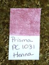
I added a layer of slate gray. And now I have the depth I need, but it too dull.

tb md b slate g true blue I added a layer of true blue to get the vibrancy back.  Remember, In the beginning I chose True Blue because it was the closest.
And there you have it.

I mixed this color in 4 layers using 3 pencils.  I hope you noticed that I used the same color family. The fact that these pencil colors were in a row, is an accident.  My family is not in any particular order. 

So to recap:

1.)  Find the closest match to color you want to mix.

2.) If you need to lighten  choose a lighter hue or darken choose a darker hue, but from the same family

3.) Add your closest match back on top.

Which brings us to your next lesson. 

Get your chips, pencils and color family charts and start mixing.

Use your drawing paper, index cards or whatever you can find. Draw 1 in. diameter circles and fill those with your color mixes.

You will be doing this for a bit!

Other lessons:

Color Theory and the Color Wheel

Techniques 1

Techniques 2

Enjoy!

Be Well and Happy!

Techniques Part 1

I hope this finds you a little better acquainted with your colored pencils and getting accustomed with how they perform.  This lesson is as exciting as the last, but just a necessary.  This week we will go over holding your pencil and common colored pencil strokes.

Holding Your Pencil

The way you hold your pencil affects the way write, so it would be safe to assume that it will affect the way you draw.  I don’t think there is any right or wrong way to hold your pencil, but changing the grip changes the style of your art.

No matter what grip you choose, I do find that holding your pencil in relaxed manner will help your avoid sore hands and wrists.

Below is a few ways to hold your pencil:

OverhandUnderhandWriter's

1.)  Overhand grip:  With this position, you are gripping the pencil with the forefinger and thumb while the pencil is resting on your middle finger.  The pencil point is on its side as it strikes the paper.   The strokes are made with the motion of the wrist.  This grip is for heavier markings.

2.)   Underhand grip:  With this position, you are gripping the pencil with your thumb as it lays in the between the index and middle finger.  The pencil point is again, is on its side as it strikes the paper.  The strokes are made with the motion of the arm.  I find this grip awkward and uncomfortable.

3.)  The “writers” grip:  The most commonly used and with this position, you hold the pencil as you would write.  The pencil is gripped with the forefinger and thumb while the shaft rests between those two fingers.  The pencil point can be on its side and directly on the point as it strikes the paper.   The strokes can be made with the motion of the  wrist as well as the arm.  This position is the most common because it gives the artist more control and precision.

close gripfurther back

If you position you hand closer to the end of the shaft, you have more control and precision, but heavier strokes (darker markings).  The further up the shaft you place your grip gives you less control and precision, but lighter stroke (lighter markings). 

Colored Pencil Points


pointblunt


A sharp pencil point  when applied,  saturates color through the texture of the paper.  Sharpening your pencil often, usually every minute or so, will keep work precise as well as saturated with color.

A blunt pencil point when applied,  allows the texture of the paper showing through.  You will be able to see specks of the paper through the pencil.

Colored Pencil Pressure

P Pressue (1)

Colored pencil is a translucent medium.  by changing the pressure on your pencil, you can make three varying degrees of color

Light – tints the paper

Medium – excellent for layering

Heavy –  flatten the paper tooth

Colored Pencil Strokes

P Pressue (2)

1.) Hatching – Are lines parallel  to each other whether vertical or horizontal. Can be different weights of lines, unevenly spaced and the changing of colors.

2.) Cross hatching – Is the same as hatching but the lines cross over each other in different directions.

3.) Circular– The stroke is more oblong than circular and the most commonly used.  These overlapping circular strokes are the easiest way to achieve even color.  Keep your oblong small and your pencil points sharp.

4.) Linear – Layer in one direction, keeping lines close together. Stagger the line length or you will have bars of uneven color. Make sure that pencil point is sharp.

5.) Scumbling – “brillo pad”  interlocking squiggles.  This stroke is uneven and creates interesting textures.

In this weeks lesson you will need to draw a series of squares of different sizes and fill them with different colored pencil strokes using different points as well as pressures. Practice makes perfect so draw plenty!

Until next week….

Be Well and Happy!

Color Theory and the Color Wheel

DSC_0480Maybe, you should stop right here and make yourself a cup of strong coffee before you read any further.  I want you to stay awake until the end because it is going to be a long and very dry post.

This information may seem a little redundant as most if not all of this information is available inside every (how to) art book published. But here it is anyway:

Color Vocabulary

  1. Primary Colors:  Colors that can not be mixed from any other color.  On the color wheel the colors are Red, Blue, and Yellow.  In the Prismacolor range the colors are as follows:  Process Red, True Blue, and Canary Yellow.
  2. Secondary Colors:  Two primary colors mixed together.  On the color wheel the colors are Orange, Green and Violet.  In the Prismacolor range the colors are as follows: Orange, Grass Green, and Violet.
  3. Tertiary Colors: One primary color and one secondary color mixed together.  These colors are commonly referred to as hues.  On the color wheel the colors are Blue-Green, Yellowed-Green, Yellowed-Orange, Red-Orange, Red-Violet, and Blue-Violet.  In the Prismacolor range the colors are as follows:  Parrot Green, Limepeel, Spanish Orange, Poppy Red, Mulberry, and Violet Blue.
  4. Warm Colors – Are aggressive colors that make object appear to move toward the viewer. The warm colors are Yellows, Reds, and Oranges.  If these colors are used to the maximum, it will inspire the viewer to feel anxious.  Ex: A painting of fire.
  5. Cool Colors –  Are receding colors that make objects move further away from the viewer.  the cool colors are Greens, Blues, and Violets.  If these colors are used to the maximum, it will inspire the viewer to feel calm. Ex: Ocean scene.
  6. Hue –   Another name for color.
  7. Tint –  Color with added white.  There are so many colors available in this medium today.  It is better to simply choose another lighter color than to layer a white over a darker color.  If you aren’t careful, applying this technique will flatten the vibrancy of the color that you are trying to achieve. (Unless you are burnishing)
  8. Shade –  Color with added black. I have the same feeling with this method as I do with Tint.
  9. Neutral Gray-  White and Black mix. It works but it’s a bit boring.  Using the color’s complementary makes the perfect washes for grays, shadows and browns.
  10. Intensity or Chroma – Brightness or dullness of a color.
  11. Value –  The lightness and darkness of a color.

Color Relationships

Colors create mood and different color combinations,  if applied properly,  will make your work convey the message that you want conveyed.  Whether it be calm, soothing, happy, intense, angry, and sad.  Color is that powerful!

  1. Monochromatic – Using any one color as tone, tint and shade.  The only way that I can explain this is that it like a graphite drawing but using one colored pencil.  Most popular colors to use are Sepia, Umbers and Indigo blue.
  2. Analogue – Are colors that lie adjacent to each other.  On the color wheel one combination could be Blue, Blue-Violet, Violet, and Red-Violet.  In the Prismacolor range the colors are as follows: True Blue, Violet Blue, Violet, and Mulberry.
  3. Achromatic – Colorless scheme using Blacks, Whites, and Grays.
  4. Color and Light – Colors used to create a mood.  Intensifying some and receding other colors.  Ex: Painting of a dark street with one lone street light.  Intensifying the colors of the light and dulling out the surrounding street makes the light brighter dulling and receding the surrounding area.
  5. Complementary – Combining a tint or tone of one color and the color opposite of the color wheel.  Choosing a color’s complementary creates  neutral shades, shadows and a mix of beautiful grays and browns. Ex:  Yellow’s complement is Violet. In the Prismacolor range the colors are as follows:  Canary yellow, and Violet.
  6. Split Complement – Choosing a color and using colors on each side. Ex: Violet, Yellowed-Orange, and Yellowed-Green.  In the Prismacolor range the colors are as follows: Violet, Spanish Orange, and Limepeel.
  7. Diad – Using two colors that are two colors apart on the color wheel. Ex: Red and Orange.  In the Prismacolor range the colors are as follows:  Process Red and Orange.
  8. Traid – A color scheme in which three colors are equally spaced from each other on the colored wheel.  Ex: Red, Blue, and Yellow.  In the Prismacolor range the colors are as follows:  Process Red, True Blue, and Canary Yellow.
  9. Tetrad – A contrast of four or more colors on the color wheel. ex: green, violet, red and yellow.  In the Prismacolor range the colors are as follows: Grass Green, Violet, Process Red and Canary yellow.
  10. Double Complementary – Color scheme that is two colors next to each other on the color wheel. Ex: green, yellowed-green, red, and red-violet.  In the Prismacolor range the colors are as follows: Grass Green, Limepeel, Process Red, and Mulberry.

This information barely scratches the surface.  If you are interested in a more in-depth study in color theory there is plenty of information available from the web as well as books dedicated to this subject.  If you draw from imagination you really need a intense working knowledge of color theory.  When drawing fantasy, your art still has to flow and the colors have to visually make sense, even if your skies are green and your trees are blue.

But if you are like me and you draw what you see,  simply separating your colors into their color family and knowing it’s complement will take care of most of the issues an artist would have in choosing suitable colors to make your art flow as it should.

Which leads us to this week’s lesson.

1 – Separate your pencils in to their Color Families. Below is the list of each family and a sample pencil color from each group.

Color                                         Prismacolor Color

Yellows                                       Canary Yellow

Yellowed-Oranges                    Spanish Orange

Oranges                                     Orange

Red-Oranges                            Poppy Red

Reds                                           Process Red

Red-Violets                               Mulberry

Violets                                       Violet

Blue-Violets                             Violet Blue

Blues                                        True Blue

Blue-Greens                           Parrot Green

Greens                                     Grass Green

Yellowed-Greens                    Limepeel

Additional:

Warm Grays

Cool Grays

French Grays

Metallics

Browns

***If you are having trouble choosing where a color should be classified, scribble your pencil on the edge of white sheet of paper.  You should be able to match it to the appropriate color family from one of the hue samples on the back of the color wheel.

2 – After you finish  grouping your colored pencils, you will need to make a chart.   There are many ways to this:

Chart A book – using card stock

Chip    A color chip using card stock

A Color Wheel Chart (click link)

IMG_5378

This is what I find to be the most useful.  This was printed out on printer paper.

Whatever method you use, Be sure to list and include:

~The Brand of pencil

~ Number of pencil

~Color of pencil

~ Make each swatch 3/4 in. square and saturate each  with color (be heavy handed)

~Punch hole center of swatch area (that is lacking in two of the above examples).

This may seem boring, but it will give you a chance to get acquainted with your pencils as well as a working knowledge of how they perform.

Until next week….

Be Well and Happy!

You’re Beautiful!

Pink 1

Pink – Fan Art

Prisma Color on 9 x 12  98 lb.  XL Canson Mixed Media

 I know, I know…Pink didn’t sing You’re Beautiful, I am just stating a fact

When you draw or paint someone, the whole face is broken down into minute details.  I never realized just how beautiful people are until I started studying them.  And it isn’t just hypnotic eyes, a great set of perfectly arched brows or that square jaw that makes a person attractive.  It’s what we see as flaws that makes us beautiful and unique.  I’m not saying that you shouldn’t turn that one brow in to two…cause if ya can (male or female)  you should. And I’m definitely doing all I can to slow that clock down.  But some things should be left alone.  Take Pink for example:  What I find is her most attractive feature is her front teeth.  The left tooth is a bit crooked and sticks out the tiniest bit.  Excuse the language, but she’s such a badass (there is no other word to describe a woman who can hang from a ceiling wrapped in a rope) that to me it gives her a little bit of vulnerability.  And makes her absolutely gorgeous in my book!

On with the portrait:  Pink is my first portrait painting and she wasn’t easy, but a joy to paint. The plaid shirt is what gave me a fit.  But when things got too difficult, I would just stop, take a breather and paint a little more.  I should have timed myself, but I  definitely have a lot of days and nights invested in this head study.

This portrait ends my summer on a good note because I did what I set to do.  And that was to complete art in colored pencil.

I hope this post finds you all having a beautiful and creative weekend.  And remember, you are beautiful.  And if you don’t see it then you aren’t looking in the right places 😉

Be Well and Happy!

Tada!

colored pencil dog

Beagle

5 x 7 Colored Pencil on Canson XL Mixed Media

Well, I said I wouldn’t post any art unless it was colored pencil and here it is.  I am so pleased with how this turned out. My favorite part is the eyes.  Man, I love drawing them eyeballs, LOL…

I am learning so much and I am getting more comfortable with colored pencil, it’s still a struggle but it is more controlled (which is a good thing).  And I am very excited to start something else, as soon as I figure out what that something is 😉

You guys have a great weekend!

P.S. Colored pencil Lovers: If you are looking for a paper give the Canson XL mixed media a try.  This paper has a lot of tooth and at 7.98 a pad from Jerry’s Artarama, it’s a real bargain.

Be Well and Happy!