Tricks and Troubleshooting…

  1. Rubber shelf liners are perfect to lay under your work area.  The rubber like quality will keep your pencils from rolling in the floor and breaking.
  2. When your lead is broken in the shaft.  you can wrap the pencil in a paper towel and microwave for a few seconds at a time.  When your pencil is very warm to the touch, lay the pencil to the side until the wax/oil hardens.  (the broken pieces will melt and harden back in to one piece)
  3. Can’t find that perfect colored paper?  Simply paint your white paper with a watercolor wash for custom colors.  You may need to do a test on scrap to make sure your paper doesn’t buckle.
  4. Always wear a max when working with solvents and in a well ventilated area.  Even if the solvent is odorless the chemicals are still in the air.
  5. Dust off your pencil after every sharpening to avoid smearing the color dust on your work.
  6. Workable fixative will add more tooth to your paper.
  7. Unless the drawing aspect of your painting is off, keep going no matter how bad you think it looks.  The painting will have  ugly stages. It is during the ugly stages when most  gives up. DON’T ! Keep going until you are either satisfied or have no more tooth left to work with.  I have to remind myself of this constantly, with any medium.
  8. If you lose you whites, you can go over that area with a little gouache or a white Stabilo pencil. Be aware!  If you use these methods, your piece becomes a mixed media for contests in most cases.
  9. If your pencil is too short, super glue your pencil stump  to a longer colored pencil of the same color.
  10. I learned this lesson the hard way!  If have to trim a brand new pencil, make sure the color the number and color is on the opposite end of where you are sharpening.


I hope you have enjoyed this little mini series. I certainly enjoyed sharing.   If you want to learn anything that I glazed over, it can be found easily on the internet.    Best of Luck in Colored Pencil endeavors!

Other Lessons:

Color Wheel and Color Theory

Techniques 1

Techniques 2

Mixing Colors

Mapping Color

More on Colored Pencils

Be Well and Happy!

More on Colored Pencils.

pencils

Lighfastness

Lightfastness is how fast the colors lose their vibrancy and fade due to chemical breakdown in direct sunlight.  Most if not all colored pencil manufacturer’s have some pencils colors that are more robust and handle the sunlight better others.  Some artists will choose pencils that are more lightfast.  All mediums stand the risk of fading as well as anything exposed to UV rays.  My opinion is, anything with any pigment or dyes exposed to the direct sunlight will fade over time, so I don’t concern myself too much.

To aid in preventing your art from fading, Don’t hang your art near windows and doors. OR Make a print of your art and store the original in dark, dry place at room temperature.

Wax Bloom

Wax Bloom is the oxidation of the wax creating a white cast of film over your completed art.  To combat this:  First wipe your art down with a dry soft cloth and spray with a fixative.

Next week will be the last post in this series. Below, you see prompts for you to color map and paint.  It is not necessary to use my prompts.  Walk around your home.  Choose simple items in color and design, paint the items in your purse, tool bag, or junk drawer.  Choose anything, everything.

  1. leaf
  2. light bulb
  3. tree bark
  4. your favorite beverage
  5. all or part of a remote
  6. your front door
  7. a tube of lipstick / chap stick
  8. a tool
  9. a kitchen utensil
  10. a cookie
  11. sunglasses
  12. gloves
  13. jewelry
  14. a child’s toy
  15. a coaster
  16. a candle
  17. purse / wallet
  18. comb
  19. a colored pencil
  20. breakfast food
  21. favorite keepsake
  22. snack
  23. hairbrush
  24. a book
  25. nail file

I can’t stress enough how important it is to be proficient in mapping color.  It may be a pain, but it is so easy and helps you stay quite a few steps ahead of the game.

Other Lessons:

Color Wheel and Color Theory

Techniques 1

Techniques 2

Mixing Colors

Mapping Color

Enjoy!

Until Next Week….

Be Well and Happy!

Mapping Color

When we buy a colored pencil technique book, we expect great things.  This book will answer all our questions, solve all of our issues and by the end we WILL be as good (if not better) than the author.  Then we go through book, screw up a few traced exercises then curse, scream and set the book on fire!  Well, no… not really but if you have worked with the demos, you have wanted to.    I have learned some great tricks in colored pencil,  but what I am saying is that you should not the last half of these books to teach you how to paint in colored pencil.  Teach yourself.

Let me go on record saying, “I love my colored pencil books and don’t see them as a waste of money. But authors have been painting for years and years before they had their very own book published. Those exercises are just too difficult for the novice.”

It took a long time for me to figure out that in trying to paint those demos, what I was actually doing was trying to replicate the “style” of the artist. I was learning nothing, and if by chance I did complete a demo, I could not paint another using my own reference.  I don’t know about you but I’m not a protégé of one the old masters.  I don’t want to waste time studying their style of art to crank out pieces…or not able to crank out anything.

Out of all the mediums, colored pencil is the most difficult to manipulate because it is pushed to the very boundaries of its capability.  Colored pencil is not an easy medium to learn, but with a little planning you can be more confident in your endeavor.

Do you remember when you were in high school and the Geography teacher made you draw and color key maps?  You know, color green, the region whose cash crop is peas and make the lakes blue…yada yada yada…..Painting in color pencil is similar to those maps, but only more intricate.

I am going to assume that you can draw a little bit, but even if you can’t this exercise should be fairly easy.

Below is a plastic heart that I found in my daughter’s room.  I chose this subject because it simple in design, it is bright but only has few colors.  It will also be your reference and your only demo (ish) in the series.

heart3

Drawing

heart2

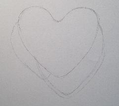
As you can see, this line drawing is a little messy. I have a couple of smudges and eraser marks. These mars would be fine if I were drawing.  But in colored pencil,  the pencil marks would show up through the wax pencil and impossible to erase.  You can solve this by transferring your drawing on clean paper and in a few different ways using:  a projector, light box, graphite paper,  or simply taping your drawing to a window (during full sun)  with a clean paper overlay.  Use very light strokes just dark enough for you to see where the color goes. An even better solution is to use the basic color of your reference to outline the drawing (red heart=red or pink pencil)

  ****Just to be safe, always transfer your drawing!

Mapping Color

heart1 heart map

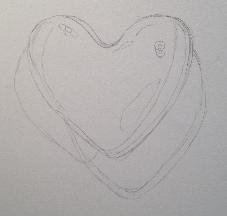
Mapping color is when separate the different colors and/or color changes in your drawing.  As your color changes within the same object you would use the graduation method using circular strokes in light layers to block in color. The more thorough you are in mapping out color the more realistic your art will be.

Above is the drawing with my colors mapped out.  The picture on the right is the same as the left but drawn in ink to make the heart more visible.

Color Choice Legend

From the numbered drawing above on right

1.) This indicates where my light source is coming from (top left almost center) and is called the highlight.  The highlight is the lightest part of the painting because that is where the light is concentrated.  Some artists go from painting the light colors first and the darks last, and others do the opposite.  Just paint what you feel confident with, but remember lighter mistakes are easier to erase.

2.) Is a darker value of base color.  The object is on a curve and it isn’t receiving as much light The lack of light causes a shadow because the light has move around the object.

3.) Is the graduation of the  darker base color and in to the overall color you choose for the heart.

4.) Is the reflected light and it indicates the shape of the object as the light curves around that area.

5.) Is a shadow.

6.)It’s the shadow’s edge.  Is a lighter hued shadow, but still a shadow

7.) Is the cast shadow and is the darkest area of the drawing.

8.)  The light can reach further around the object but  is still casting a light shadow of the true color of the heart.

***Whatever isn’t labeled, is the true overall color of your heart.

Blocking In Color

Blocking in color is the laying down of color in a very light layer indicating where you want the colors to go.  For example: I would paint in the shadow using a very light cloud blue or a gray to indicate where my shadow would go.  And after I mixed my red, I would use the lightest hue for the overall heart, and the darkest hue for the heart’s shadow.  I would save the highlights for last so I could burnish into the very white of the highlight.

This Weeks Lesson:

Draw this heart. Don’t draw the heart too big or too small.  If drawn too big, you will spend too much time on this and if you mess up, you will be too frustrated to try it again.  If drawn to small, you have a hard time navigating your way through will result in more frustration.

Then, after all of this and you are still wanting more?  Mix color chips and use the one and two color graduation.

Other Lessons:

Color Wheel and Color Theory

Techniques 1

Techniques 2

Mixing Colors

Enjoy!

Be Well and Happy!

Mixing Color

photo

Mixing color was my Achilles’s  heel.  I had so many colors, yet I could mix the right hue.  I know that a color doesn’t have to be exact but it didn’t stop me from want to copy that exact shade or wanting to throw my pencils in the woods when I couldn’t.  There are times when mixing the right hue (like skin) is pretty important and I just could not do it!

Now I find mixing color easy and I almost always mix the color right on the first try.  And instead of cursing all of my pencils and I am very happy that I have so many options.

By now, you should be well acquainted with your pencils. And remember the Color Family Sheets?  This is where they become integral in color mixing.

Value Finders

Black

   Value finders are small business card sized (card) stock in white and black with a hole in the center.  The finders are used to block the colors that surround the color that you want to mix.  It also changes how your mind interrupts the subject.  For example, Let’s say I am painting a gold candle holder.  If I look at the candle holder, my mind tells me  to pick up that gold metallic pencil. It’s gold right? I paint it gold.  It looks nothing like the holder, and I’m completely lost.

 This example is commonplace.  People have a hard time trying to wrap their head around seeing the color through the metal.  But, if I take that same candle holder and I place a view finder on top,  I don’t see the object or the values surrounding that object.  I only see the area color that I want to duplicate.  I paint the holder with  some ochres and goldenrod, maybe a little Jasmine and a couple of greens. Now,  I have a realistic gold.

Color Mixing

In colored pencil there are no formulas. Well, there is kind of, but that is dependent upon you.  Some people can achieve the desired hue using a couple of pencils and others it take more. It just depends on the way you see the color and the pencil combination that you choose.

Although mixing colors in colored pencil is not really an exact science, I will show you how I mix color as well as my thought process.  It’s simple and I have yet to find a  color that I can’t mix.  AND I found that this is so much fun, that I ran out of chips and went back to Lowe’s to get more.

The color I am mixing is 5002-108 Pool Party from Valspar. I am using the back of an index card, 132 Prismacolor set, and my color family charts.

tb

As I lay the chart over the swatch, I notice that true blue from the blue family is the closest match to Pool Party. After, I painted true blue I noticed the color wasn’t deep enough and I needed a deeper blue.

tb mb

  I added a layer of Mediterranean Blue and the depth is close, but not close enough. I still needed a deeper blue.

tb mb s graayI added a layer of slate gray. And now I have the depth I need, but it too dull.

tb md b slate g true blue I added a layer of true blue to get the vibrancy back.  Remember, In the beginning I chose True Blue because it was the closest.
And there you have it.

I mixed this color in 4 layers using 3 pencils.  I hope you noticed that I used the same color family. The fact that these pencil colors were in a row, is an accident.  My family is not in any particular order. 

So to recap:

1.)  Find the closest match to color you want to mix.

2.) If you need to lighten  choose a lighter hue or darken choose a darker hue, but from the same family

3.) Add your closest match back on top.

Which brings us to your next lesson. 

Get your chips, pencils and color family charts and start mixing.

Use your drawing paper, index cards or whatever you can find. Draw 1 in. diameter circles and fill those with your color mixes.

You will be doing this for a bit!

Other lessons:

Color Theory and the Color Wheel

Techniques 1

Techniques 2

Enjoy!

Be Well and Happy!

Techniques Part 2

   I hope that you have found Techniques Part 1 helpful.  If you have mastered the circular stroke then you are well on your way! In my opinion that is the most important one to learn.  I didn’t let you in  on my little secret because all of the strokes will come in handy at some point whether you use graphite, pastel, or colored pencil.

Part 2 of the Techniques lesson is a little random, but still it’s information that is important in getting started with colored pencils.

Erasing

Which do you want first, the good news or the bad news?

The bad news is colored pencil can not be completely erased.  You can lighten the marks a great deal, but a slight tint will still remain.  That’s not to say that you shouldn’t try to remove mistakes, but be very careful, very gentle and keep in mind, that you will probably destroy the tooth of the paper before you remove the pencil in its entirety.   Keeping your layers light will help in removing mistakes because a light layer is usually sitting on top and not in the tooth of the paper.

And I don’t have any good news except making big boo boos may force you in to being very creative in making them less noticeable.  The types of eraser excellent for colored pencil are:

1)  A kneaded eraser –  Stamp the eraser on the mistake will lighten color.  By stamping,  I mean roll the eraser in a ball and hit the offending area gently.   Poster Mounting putty works well too.

2)  A battery operated eraser IS the bee’s knees!  It’s a little rough on the paper so go easy.  Excellent for negative drawing, highlights, and whiskers.

3)  Removable scotch tape It’s not an eraser, but it  works well in removing color.  Gently place the tape on the color you wish to remove and then color with a pencil in the area on top of the tape in which you want the color removed.  Remove tape.

****F.Y.I.  If working on black paper ALWAYS ALWAYS ALWAYS use a black eraser.  White, red, or gray erasers will actually stain your paper the eraser color.

Impressing

6Is the best way to produce clean lines in artwork, for example:  Animal whiskers, veins of leaves, and feathers.  If you want white lines,  then this should be the first step.  But,  if for example,  you have a leaf with light green veins.  First, you color the area in a light green (or a light green mix), impress your lines, then proceed to your normal painting.

To impress, place a sheet of tracing paper on your drawing.  Use a 2H or a 4H pencil and with heavy pressure  draw the lines that need impressed. Remove the tracing paper and paint your art as normal.  You should have clear lines as if by magic 😉

Don’t use such heavy pressure that it cuts the tracing paper.

***F.Y.I. Impressing your signature, is great to use with a dark background.

Sgraffito

5Sgraffito is a technique used to scrape out a color revealing the color underneath using an exacto knife. The wax in colored pencil is soft  and it takes very little effort to scratch out color.  It is used for scraping out lighter grass, veins of leaves, hair etc.  Keep in mind the paper has to be pretty saturated with color for this method to really be useful.

Burnishing

1Burnishing is used to give your art a shiny appearance such as metal, glass, some fruits and vegetables etc.  It is the very last step because after you burnish it is rare that you can layer more color on top of the burnished area.

To burnish is to use heavy pressure and saturating your paper with so much pigment and wax that it obliterates the tooth. The artist can burnish many different ways, such as using a paper stump, a colored pencil of a different color and a colorless blender.  A colorless blender is a wax based pencil with no pigment.

Blending

2Unlike acrylic, watercolor and oil which is mixed in a palette, colored pencil is mixed directly on paper. To blend you can either use the Colored Pencil Strokes from the previous lesson or just lay the pencil point on its side to achieve even coverage.  And in the blending of two or more colors,  is where your knowledge of color theory may come in handy. You can also blend with solvents such as:

1.)  Gambasol – use with a paint brush, q-tip, cotton pad or paper stump in a well ventilated area.

2.)  Prismacolor’s Clear Blender It’s like a clear magic marker.  To keep the tip clean between colors and after use, mark sides on a clean piece of white paper.  If you do not do this step, your marker is stained with the previous color and ruined.

This weeks lesson:

1.) One and Two Color Graduations.

43Starting with a sharp point and heavy pressure, saturated one end of your rectangle with color.  As you progress toward the middle use lighter pressure and fade out.  (If you are having difficulty, try moving your hand up the pencil shaft)For  two color graduations fade out  2/3 of the way through. Then, on the opposite side start the other color.   (The samples above are True Blue, Process Red and Lemon Yellow.)

On your drawing paper draw many 3/4 x 3 in. (approx.) rectangles and in each rectangle  Paint one color graduation and two color graduation bars using colors from the color wheel.

2.)  Take a trip to Lowe’s, Home Depot (or maybe Walmart)  and pick up paint chips in Flat.  Semi Gloss, Satin or Gloss are too distracting.  Pick up as many different samples as you can.

Also See:

Color Theory and the Color Wheel

Color Techniques Part 1

Until next week…

Be Well and Happy!

Techniques Part 1

I hope this finds you a little better acquainted with your colored pencils and getting accustomed with how they perform.  This lesson is as exciting as the last, but just a necessary.  This week we will go over holding your pencil and common colored pencil strokes.

Holding Your Pencil

The way you hold your pencil affects the way write, so it would be safe to assume that it will affect the way you draw.  I don’t think there is any right or wrong way to hold your pencil, but changing the grip changes the style of your art.

No matter what grip you choose, I do find that holding your pencil in relaxed manner will help your avoid sore hands and wrists.

Below is a few ways to hold your pencil:

OverhandUnderhandWriter's

1.)  Overhand grip:  With this position, you are gripping the pencil with the forefinger and thumb while the pencil is resting on your middle finger.  The pencil point is on its side as it strikes the paper.   The strokes are made with the motion of the wrist.  This grip is for heavier markings.

2.)   Underhand grip:  With this position, you are gripping the pencil with your thumb as it lays in the between the index and middle finger.  The pencil point is again, is on its side as it strikes the paper.  The strokes are made with the motion of the arm.  I find this grip awkward and uncomfortable.

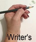
3.)  The “writers” grip:  The most commonly used and with this position, you hold the pencil as you would write.  The pencil is gripped with the forefinger and thumb while the shaft rests between those two fingers.  The pencil point can be on its side and directly on the point as it strikes the paper.   The strokes can be made with the motion of the  wrist as well as the arm.  This position is the most common because it gives the artist more control and precision.

close gripfurther back

If you position you hand closer to the end of the shaft, you have more control and precision, but heavier strokes (darker markings).  The further up the shaft you place your grip gives you less control and precision, but lighter stroke (lighter markings). 

Colored Pencil Points


pointblunt


A sharp pencil point  when applied,  saturates color through the texture of the paper.  Sharpening your pencil often, usually every minute or so, will keep work precise as well as saturated with color.

A blunt pencil point when applied,  allows the texture of the paper showing through.  You will be able to see specks of the paper through the pencil.

Colored Pencil Pressure

P Pressue (1)

Colored pencil is a translucent medium.  by changing the pressure on your pencil, you can make three varying degrees of color

Light – tints the paper

Medium – excellent for layering

Heavy –  flatten the paper tooth

Colored Pencil Strokes

P Pressue (2)

1.) Hatching – Are lines parallel  to each other whether vertical or horizontal. Can be different weights of lines, unevenly spaced and the changing of colors.

2.) Cross hatching – Is the same as hatching but the lines cross over each other in different directions.

3.) Circular– The stroke is more oblong than circular and the most commonly used.  These overlapping circular strokes are the easiest way to achieve even color.  Keep your oblong small and your pencil points sharp.

4.) Linear – Layer in one direction, keeping lines close together. Stagger the line length or you will have bars of uneven color. Make sure that pencil point is sharp.

5.) Scumbling – “brillo pad”  interlocking squiggles.  This stroke is uneven and creates interesting textures.

In this weeks lesson you will need to draw a series of squares of different sizes and fill them with different colored pencil strokes using different points as well as pressures. Practice makes perfect so draw plenty!

Until next week….

Be Well and Happy!

New Series!

I’m starting a new series Monday!

Getting started in Colored Pencil

So, if you would like to follow along you will need:

1.)  Colored pencils –  Most popular -Sanford’s Prismacolor

Or just use what ever you have…. If it’s student grade: The lead is much harder  and the color won’t be as vibrant as Prismacolor,  but all summer I painted in  my Zentangle and card making pencils,  which is a mix of 50 count Crayola, Michael’s Artist Loft, and Joann’s Fabric’s Simply Art.  Just get as many different colors as you can get your hands on!

Don’t think you can’t make beautiful art with student grade supplies…Because you can!

2.)  Kneaded Eraser or Poster Putty

3.)  Color Wheel

4.)  Pen and Pencil

5.)  Click Eraser

6.)  Drawing Paper or Vellum 90 lb. or above

7.)  Sharpener

8.)  Hole Punch

9.) Printer paper

10.) Rubber bands

11.) Scotch Removable Tape

12.) Blending stumps and/or Q-tips

Optional:

13.) Battery operated eraser – I LOVE LOVE LOVE MINE!  It’s only about $6.00 at Michael’s and with their weekly 40% coupon?  Buy one if you can!

14.) A circular template of some kind.

15.)  Small black card and a small white card with a hole punched in the center

Hope to see you there!

Be Well and Happy!