 Maybe, you should stop right here and make yourself a cup of strong coffee before you read any further. I want you to stay awake until the end because it is going to be a long and very dry post.
This information may seem a little redundant as most if not all of this information is available inside every (how to) art book published. But here it is anyway:
Color Vocabulary
-
Primary Colors: Colors that can not be mixed from any other color. On the color wheel the colors are Red, Blue, and Yellow. In the Prismacolor range the colors are as follows: Process Red, True Blue, and Canary Yellow.
- Secondary Colors: Two primary colors mixed together. On the color wheel the colors are Orange, Green and Violet. In the Prismacolor range the colors are as follows: Orange, Grass Green, and Violet.
- Tertiary Colors: One primary color and one secondary color mixed together. These colors are commonly referred to as hues. On the color wheel the colors are Blue-Green, Yellowed-Green, Yellowed-Orange, Red-Orange, Red-Violet, and Blue-Violet. In the Prismacolor range the colors are as follows: Parrot Green, Limepeel, Spanish Orange, Poppy Red, Mulberry, and Violet Blue.
- Warm Colors – Are aggressive colors that make object appear to move toward the viewer. The warm colors are Yellows, Reds, and Oranges. If these colors are used to the maximum, it will inspire the viewer to feel anxious. Ex: A painting of fire.
- Cool Colors – Are receding colors that make objects move further away from the viewer. the cool colors are Greens, Blues, and Violets. If these colors are used to the maximum, it will inspire the viewer to feel calm. Ex: Ocean scene.
- Hue – Another name for color.
- Tint – Color with added white. There are so many colors available in this medium today. It is better to simply choose another lighter color than to layer a white over a darker color. If you aren’t careful, applying this technique will flatten the vibrancy of the color that you are trying to achieve. (Unless you are burnishing)
- Shade – Color with added black. I have the same feeling with this method as I do with Tint.
- Neutral Gray- White and Black mix. It works but it’s a bit boring. Using the color’s complementary makes the perfect washes for grays, shadows and browns.
- Intensity or Chroma – Brightness or dullness of a color.
- Value – The lightness and darkness of a color.
Color Relationships
Colors create mood and different color combinations, if applied properly, will make your work convey the message that you want conveyed. Whether it be calm, soothing, happy, intense, angry, and sad. Color is that powerful!
-
Monochromatic – Using any one color as tone, tint and shade. The only way that I can explain this is that it like a graphite drawing but using one colored pencil. Most popular colors to use are Sepia, Umbers and Indigo blue.
- Analogue – Are colors that lie adjacent to each other. On the color wheel one combination could be Blue, Blue-Violet, Violet, and Red-Violet. In the Prismacolor range the colors are as follows: True Blue, Violet Blue, Violet, and Mulberry.
- Achromatic – Colorless scheme using Blacks, Whites, and Grays.
- Color and Light – Colors used to create a mood. Intensifying some and receding other colors. Ex: Painting of a dark street with one lone street light. Intensifying the colors of the light and dulling out the surrounding street makes the light brighter dulling and receding the surrounding area.
- Complementary – Combining a tint or tone of one color and the color opposite of the color wheel. Choosing a color’s complementary creates neutral shades, shadows and a mix of beautiful grays and browns. Ex: Yellow’s complement is Violet. In the Prismacolor range the colors are as follows: Canary yellow, and Violet.
- Split Complement – Choosing a color and using colors on each side. Ex: Violet, Yellowed-Orange, and Yellowed-Green. In the Prismacolor range the colors are as follows: Violet, Spanish Orange, and Limepeel.
- Diad – Using two colors that are two colors apart on the color wheel. Ex: Red and Orange. In the Prismacolor range the colors are as follows: Process Red and Orange.
- Traid – A color scheme in which three colors are equally spaced from each other on the colored wheel. Ex: Red, Blue, and Yellow. In the Prismacolor range the colors are as follows: Process Red, True Blue, and Canary Yellow.
- Tetrad – A contrast of four or more colors on the color wheel. ex: green, violet, red and yellow. In the Prismacolor range the colors are as follows: Grass Green, Violet, Process Red and Canary yellow.
- Double Complementary – Color scheme that is two colors next to each other on the color wheel. Ex: green, yellowed-green, red, and red-violet. In the Prismacolor range the colors are as follows: Grass Green, Limepeel, Process Red, and Mulberry.
This information barely scratches the surface. If you are interested in a more in-depth study in color theory there is plenty of information available from the web as well as books dedicated to this subject. If you draw from imagination you really need a intense working knowledge of color theory. When drawing fantasy, your art still has to flow and the colors have to visually make sense, even if your skies are green and your trees are blue.
But if you are like me and you draw what you see, simply separating your colors into their color family and knowing it’s complement will take care of most of the issues an artist would have in choosing suitable colors to make your art flow as it should.
Which leads us to this week’s lesson.
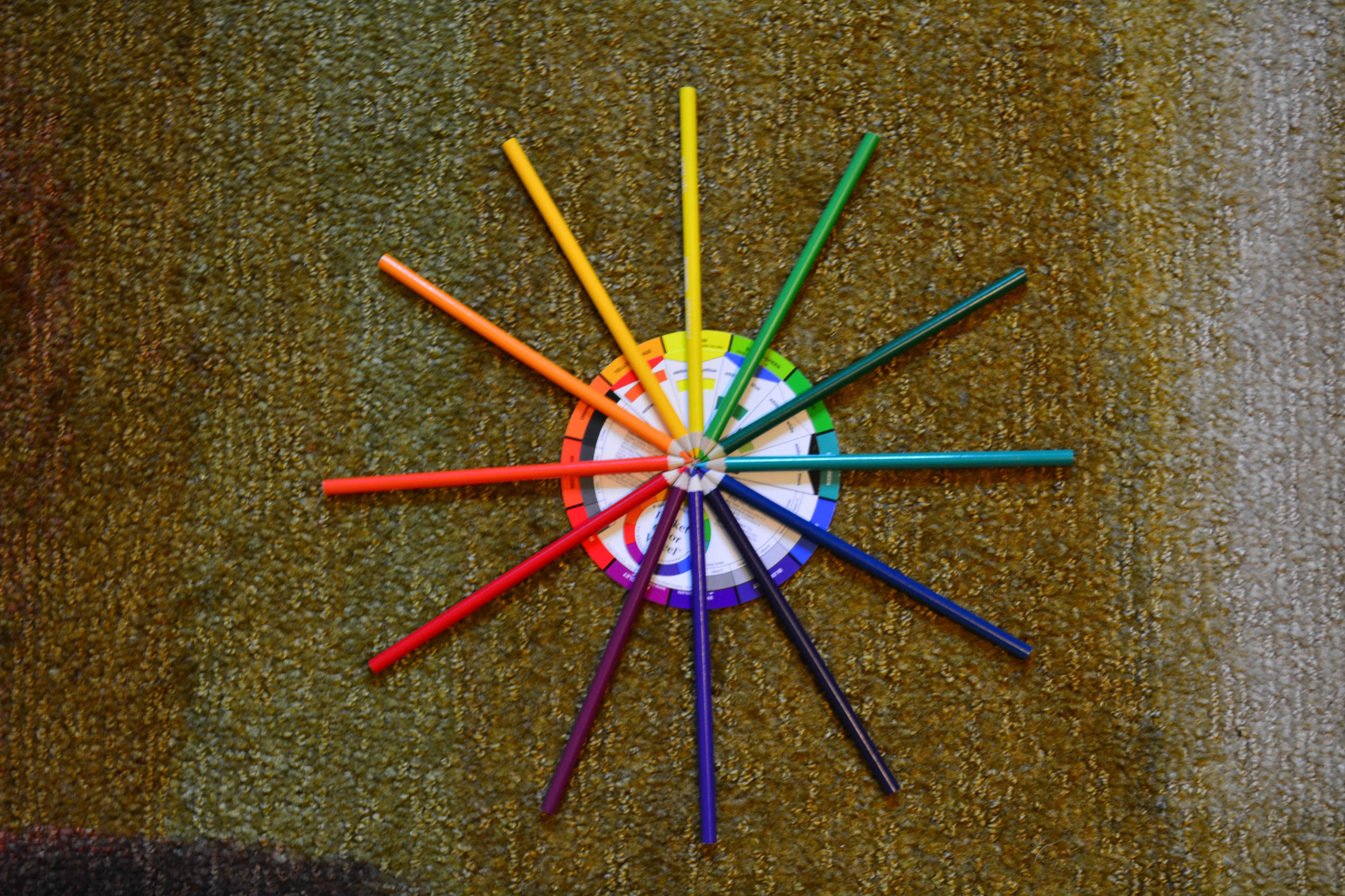
1 – Separate your pencils in to their Color Families. Below is the list of each family and a sample pencil color from each group.
Color Prismacolor Color
Yellows Canary Yellow
Yellowed-Oranges Spanish Orange
Oranges Orange
Red-Oranges Poppy Red
Reds Process Red
Red-Violets Mulberry
Violets Violet
Blue-Violets Violet Blue
Blues True Blue
Blue-Greens Parrot Green
Greens Grass Green
Yellowed-Greens Limepeel
Additional:
Warm Grays
Cool Grays
French Grays
Metallics
Browns
***If you are having trouble choosing where a color should be classified, scribble your pencil on the edge of white sheet of paper. You should be able to match it to the appropriate color family from one of the hue samples on the back of the color wheel.
2 – After you finish grouping your colored pencils, you will need to make a chart. There are many ways to this:
 A book – using card stock
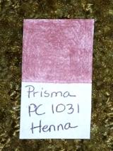 A color chip using card stock
A Color Wheel Chart (click link)

This is what I find to be the most useful. This was printed out on printer paper.
Whatever method you use, Be sure to list and include:
~The Brand of pencil
~ Number of pencil
~Color of pencil
~ Make each swatch 3/4 in. square and saturate each with color (be heavy handed)
~Punch hole center of swatch area (that is lacking in two of the above examples).
This may seem boring, but it will give you a chance to get acquainted with your pencils as well as a working knowledge of how they perform.
Until next week….
Be Well and Happy!

